Welcome!

It is not the end that defines the traveler, but the journey.

Sunday, January 30, 2011

Camera Raw

Edit:

Original:


1 & 2. Arrow: 1-29-2011; 1:28 p.m.; Rexburg; f 5.0; 1/5; Canon PowerShot SX130 IS 
The original photo has no edits and the edits made to the first photo will be explained in the paragraph below.

Through Bridge, I selected the original JPEG of "Arrow" and hit Cmd R to open the photo in camera raw. Inside camera raw, I increased the darkness of the blacks in the image, added more brightness, heightened the contrast, increased clarity, vibrance, and saturation by simply moving the sliders on the basic pallet. On top of that, in the effects pallet, I added a dark vignette with the max amount of feathering possible. Lastly, using a large adjustment brush (K), I painted over the arrow adding more exposure, clarity, sharpness, contrast, and saturation in order to really emphasize the arrow as the focal point. Once I was finished, I hit done and then hit the "Open Image" button to move the photo into Photoshop. Inside Photoshop, I added an unsharpen mask to make the picture have a grudge feel.  After adding and selecting the mask, I used the black paint brush to mask  out the arrow and the targets so that only the target block would display the harsh sharpness I desired.

Saturday, January 29, 2011

Panoramic Views

Panoramic:

Originals:


Panoramic:
 Originals:


1-5. Reflections of the Old Teton Dam: 1-29-2011; 4:05-4:06 p.m.; Northeast of Rexburg; f 4.0; 1/320; Canon PowerShot SX130 IS 
Photos 2-5 are the original unedited photos. Picture 1 is a compilation of the original photos. Once combined, photo 1 was edited in Photoshop. In Photoshop, the contrast, brightness, and saturation was heightened. Also, slight sharpness was added and vibrance was increased.

6-9. Jagged Ice: 1-29-2011; 3:38 p.m.; Sugar City; f 8.0; 1/60; Canon PowerShot SX130 IS 
Once again, edits were only made to the panoramic image. The edits made include:  increased sharpness, contrast, brightness, saturation, and vibrance.


Taking the panoramic shots was fun and yet challenging. Although I had a tripod handy, I couldn't always get the tripod as close to my subject as I would have liked. In fact, for "Jagged Ice" I merely held the camera in my hands and slowly swiveled in from left to right as I took the pictures. As for "Reflections of the Old Teton  Dam" I was able to swivel my camera on the tripod. Next, in Photoshop, I used the automate photomerge tool, selected the separate shots and watched as Photoshop stitched the pictures together. Once that was complete, I flattened the image and used the quick selection tool to select the transparent remains around the picture's edges and then used content aware fill. Some of the filled in areas looked odd so I selected the clone tool to fix some spots while others I circled with the lasso tool and used content aware again to replace odd looking bushes with snow. Lastly, I edited the final product as I explained in the descriptions above. For "Jagged Ice" I added a black layer, cut out the center using the marquee tool, and then used a blur filter to get a nice burned edge. Overall, I think I ended up liking "Jagged Ice" the best. 


Saturday, January 22, 2011

Flexible Edits


1 & 2. Splash of Life: 1-20-2011; 10:31 a.m.; Rexburg; f 6.3; 1/40; Canon PowerShot SX130 IS 
Edits made to the original include an increase in contrast, brightness, and vibrance. Saturation was also heightened.

3 & 4. Water Flower: 1-20-2011; 10:27 a.m.; Rexburg; f 8.0; 1/40; Canon PowerShot SX130 IS
In Photoshop, I added more contrast, slightly increased vibrance, and added some color saturation to make the flowers really pop.

 To create the second version of "Splash of Life" all I did was select the adjustment layer icon at the bottom of the layer's pallet. Once selected, a list of all the different adjustment layers appeared. I decided to use the Black & White option. Wanting to show the color through the rain drops, I clicked on the mask that came with the adjustment layer. Using a soft edged brush, I selected black paint and colored in all of the droplets. The black paint created holes in the mask which allowed the colors to show through at 100% opacity. This took quite some time, but I think the picture was worth the effort. For my edited version of "Water Flower", I turned the photo into a smart object and added two smart filters. This method allowed me to remove the filters' effect from part of the photo. In this photo I chose to use the mosaic tiles filter and the ocean ripple filter. Using the mask and black paint, I decided to mask out the majority of the two big pink flowers on the left of the picture. I did not mask out the outside edges of the flowers because I liked the disintegrated look. 
 

Flora & Fauna


1. Purple Leaf: 1-20-2011; 10:24 a.m.; Rexburg (Benson); f 3.4; 1/60; Canon PowerShot SX130 IS
  For this photo, I slightly added more vibrance. In addition, I increased the saturation and raised both the contrast and the brightness.

2. Tree Friend: 1-20-2011; 10:51 a.m.; Rexburg (Gardens); f 7.1; 1/20; Canon PowerShot SX130 IS 
Brightness was decreased, saturation slightly increased, and contrast was heightened.

3. Tower of Flowers: 1-20-2011; 10:23 a.m.; Rexburg; f 3.4; 1/60; Canon PowerShot SX130 IS 
 When I edited this image, I added more vibrance, contrast, and saturation. I also increased the brightness a little bit.

4. Snow Cat: 1-11-2011; 2:10 p.m.; Rexburg; f 3.4; 1/60; Canon PowerShot SX130 IS 
 Lightness was decreased, but contrast, saturation, hue, and vibrance were raised.

5. Hello There: 1-20-2011; 10:43 a.m.; Rexburg; f 7.1; 1/60; Canon PowerShot SX130 IS 
Brightness, contrast, and saturation were increased. Edges were sharpened.


Taking these shots were a lot of fun! I enjoyed chasing the squirrels around trying to get a good shot. Originally, I only planned on posting one squirrel photo, but I couldn't help but add "Hello There" to the end. It was the closest shot I took, but I thought it was a little too blurry. Thus, why I considered not posting it. I was able to time my visit to the college green house correctly so I could get pictures of the plants right after watering. I really liked seeing all the droplets on the leaves. I took several of the pictures on the Aperture Priority mode so that I could experiment with several apertures. Lastly, "Snow Cat" was the best picture out of several I took a while ago when I was looking for fauna pictures ahead of time. The cat was a neighborhood feline who was scared to death of the clicking sound my camera made. I don't really know why the exposure turned out the way it did, but I still think it is a neat shot.


Monday, January 17, 2011

Blends & Type Effects


1. Walled In; A combination of number 2&3
An overlay of rusty brown was added in order to give the photo more color. Aside from that, the other edits will be listed under the original photos.


2. Snow Bug: 1-15-2011; 5:12 p.m.; Rexburg; f 4.0; 1/60; Canon PowerShot SX130 IS 
In Photoshop, I slightly increased the saturation and vibrance.  I also heightened the shot's contrast.


3. Bricks: 1-15-2011; 11:40 p.m.; Rexburg; f 8.0; 1/60; Canon PowerShot SX130 IS 
In this photo, I only increased the brightness and contrast.

4 & 5. Beads of Light: 1-10-2011; 7:21 p.m.; Rexburg; f 3.4; 1/40; Canon PowerShot SX130 IS  
When editing this shot, I increase the contrast, brightness, and added a very small amount of saturation.


To create "Walled In", I basically dragged and dropped the brick image over the bug and then lowered the opacity. Creating a mask, I used the black brush tool to remove the brick outline from the portions of the picture I felt it did not belong. Not sure if I liked the effect I received, I decided to to hide the lay and try selecting only the green pixels from the brick photo and dragging them onto the bug picture. I also added a layer filled with a rusty brown color to get a antique grudge look. Once I finished, I discovered I liked the original effect better. Thus, I got rid of the green pixels. However, I liked the rusty brown at a very low opacity, so I chose to keep that layer. Next, I used the horizontal mask type tool to outline "Walled In" on another copy of the brick picture. After copying the selection and pasting it onto a transparent background, I dragged and dropped the words onto the photo, moving it through the layers until I found a mixture of effects I liked.  For the "Beads of Light" picture, I added a sliding type effect. To do this, I unlocked the image layer, dragged the text below the image layer, and  morphed the two layers together by selecting the chain link between the two pictures. Once with was done, I made a yellow filled layer to put below the text and copied the main image and placed it between the type layer and the new filled layer. After that, all I had to do was move the copied image inside the text to find the best fill and returned the initial image to full opacity.


Sunday, January 16, 2011

Study of Orange


1. Leaves: 1-12-2011; 12:53 p.m.; Outside University Courtyard; f 3.4; 1/125; Canon PowerShot SX130 IS 
This is my shallow depth of field shot. In Photoshop, I added sharpness to the veins in the leaves, slightly saturated the colors, adjusted brightness, heightened the contrast, and added a bit more vibrance. No blur was added.

2. Splash:1-15-2011; 10:25 p.m.; Apartment; f 3.4; 1/500; Canon PowerShot SX130 IS 
A tripod was used to capture this image. I also had to manually adjust the shutter speed on the 'Tv' mode. Flash had to be fired due to the lack of proper indoor light. Blur was added around the edges and contrast was increased. I also adjusted the brightness, color balance, vibrance, and saturated the table to pull out a nice orange-brown color. 

3. Candy Shop: 1-15-2011; 2:39 p.m.; Idaho Falls (Winco); f 3.4; 1/40; Canon PowerShot SX130 IS 
 Not much had to be done to the picture. Contrast was raised and slight adjustments were made to the saturate and vibrance.

4. City of Glass: 1-15-2011; 1:45 p.m.; Idaho Falls (Pier 1); f 8.0; 1/5; Canon PowerShot SX130 IS
Saturation, contrast, and vibrance were heightened. Brightness was lowered.

5. Cold Construction: 1-15-2011; 11:16 a.m.; BYU-I Campus; f 8.0; 1/100; Canon PowerShot SX130 IS 
This is my deep depth of field shot. I had to use a tripod in order to prevent blurring. A mask of sharpness was added. Contrast also was heightened. Levels and color balance was adjusted. Saturation was raised.

6. Sneaker; 1-15-2011; 12:29 p.m.; Idaho Falls (Ross); f 3.4; 1/30; Canon PowerShot SX130 IS 
Lowered the vibrance, heightened the saturation, raised the contrast and slightly increased the brightness.


 Orange is a bright, festive color that has many meanings and uses. Often orange is used on warning signs for construction or on clothing when people are hunting in the woods. Other times, orange represents fall and Halloween. At first I was nervous that I would not be able to find enough subjects for my shots, but, as I began exploring, I discovered that orange is everywhere! Although I took many photos throughout the week, many of them did not turn out very well; therefore, this weekend, despite the fog, I went on an excursion to see what I could find. "Splash" was by far the most difficult photo to take. In fact, the shot I selected was one photo from four sets of six. Even though I used a tripod and set my camera up to take multiple shots on a fast shutter speed, the timing was still very difficult to master. Also, since I had to use the flash, it slowed down how fast the camera could take each individual shot. "Leaves" and "Cold Construction" were both taken in Aperture Priority (AP) mode. I adjusted the size of the aperture to be small for the deep depth of field shot (f 8.0) and large for the shallow depth of field shot ( f 3.4). I posted more photos than four to add more variety, and because I couldn't choose between several of them.


Saturday, January 8, 2011

Cutouts


Photo 1 & 2. Water Fairy: 8-20-2010; 12:33 a.m.; Athens, AL; f 6.9; 1/400; Fujifilm JV100
 The only edits made to the original (photo 1) included  a change in brightness, green saturation, and a heightened contrast. 

Photo 2 & 3. Kid: 8-25-2010; 5:31 p.m.; Athens, AL; f 3.2; 1/84; Fujifilm JV100 
Edits made to the original (photo 2) include color balancing, saturation, contrast, and brightening. 


I selected my 'Water Fairy' photo to partially cut because it looked like it would be a challenge. In addition, since the photo was taken with the light slightly behind the fairy, I thought having a partially white background would create an interesting effect. While the quick selection tool is amazing, I found myself selecting most of the subject by hand with the magnet lasso and regular lasso tool. Between the holes in the fairy's wings and the cement back drop in the left corner, the job was much easier to do with the lasso. Once my subject was cut, I decided to make the contrast more defined within the refine edge tool. Sadly, this made the picture much more dark than the original. However, once I made the layer with the white deleted section visible again, I felt that the darker shadow fit quite well. 

While I felt the 'Kid' picture was not as difficult to select and refine, once I moved the cutout onto a transparent document and then dragged and dropped the baby goat onto a white background, I realized I could not remember how to make a shadow. For a moment, I even contemplated creating a new layer and painting in a shadow. Luckily I then found the drop shadow button which put a nice light shadow around the whole cutout. 

Past Photos


1. Fuzzy Stems: 6-4-2010; 7:59 p.m.; Rexburg; f 3.2; 1/32; Fujifilm JV100
For this picture I used Photoshop to add a bit more contrast to the shot. In addition, I increased the color saturation to intensify the red in the stems.  Flash was used.

2.  Shoe: 11-21-2010; 8:33 a.m.; Athens, AL; f 3.2; 1/90; Fujifilm JV100
I made the picture a tad darker, heightened the contrast, and slightly saturated the colors. Flash was used.

3. Mountain Majesty: 7-31-2010; 4:24 p.m.; Pikes Peak, CO; f/4.3; 1/400; Fujifilm JV100
In this picture, I brightened the sky, added more contrast, and saturated the blue. No flash used.

4. Benched: 10-10-2010; 11:10 a.m.; Fort Wayne, IN; f/5.9; 1/100; Fujifilm JV100
The color was balanced, brightness adjusted, and contrast increased. No Flash used.

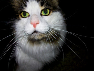
5. Kitty Whiskers: 9-26-2010; 12:43 p.m.; Fort Wayne, IN; f/3.2; 1/32; Fujifilm JV100
I darkened this photo added more saturation to get the green to pop. Flash did fire. 

During the last semester, my husband and I traveled across the states to visit family. All of these pictures were taken along the way with our small and simple Fujifilm camera. Personally, I've always enjoyed taking pictures of nature and daily items at different angles. I've never used a manual setting before, so I am excited to learn. When taking these photos, I used the macro, landscape, and portrait settings.  After taking the pictures, I uploaded them into Photoshop and made a few changes, but, due to my inexperience with the program, I did not alter the pictures much at all.